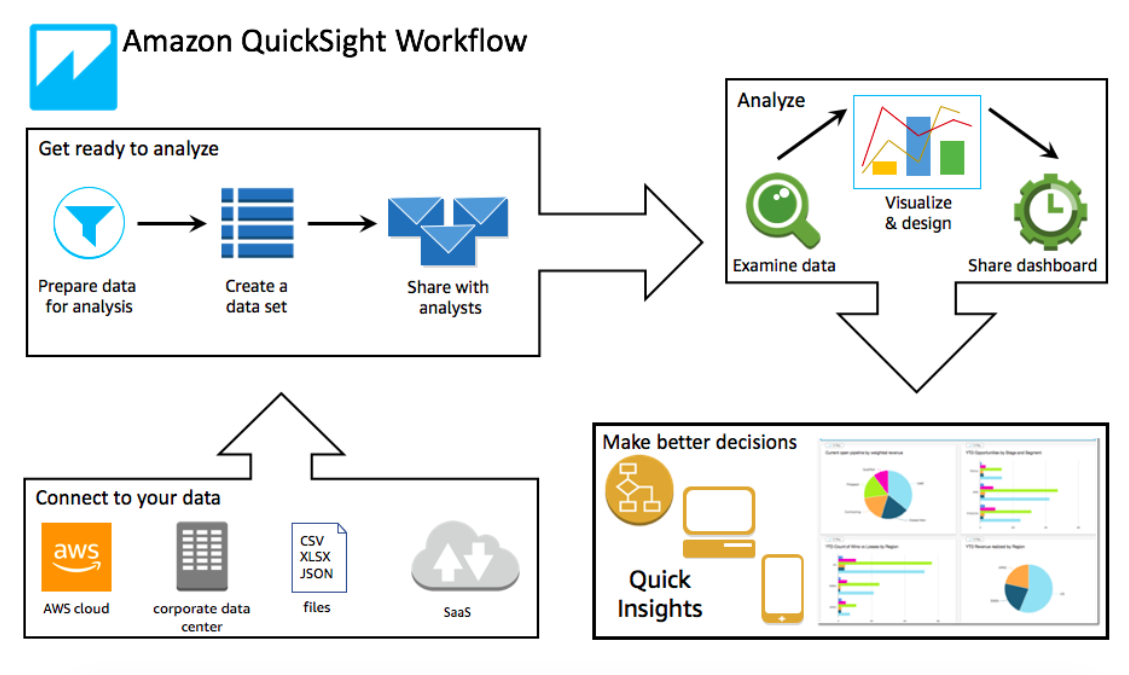
Amazon Quicksight is a quick and easy-to-use analytics tool for building visualizations of data, performing various analyses, and providing actionable insight from data. It works directly with Amazon Web Services (AWS), or AWS, allowing for a speedy setup and low up-front effort to start creating analyses and visualizations.
QuickSight also offers a built in solution, “Super-fast Parallel In-memory Calculation Engine” (SPICE), which features in-memory optimized calculation for data, and is designed for quick and up-to-date data analysis. SPICE stores data in a system on Amazon’s side that is readily available for use. Every QuickSight account gets 10GB of SPICE capacity per paid user – available across the account, in addition to a free 1GB. SPICE is one of the many features that makes QuickSight stand out as a useful analytics tool.
We’ll be skipping over simple tutorials and initial setup outlined in the QuickSight documentation and in-product tutorials on AWS QuickSight, to provide useful tips for optimizing visualizations and data in QuickSight.
How to use tables or direct queries for analyses
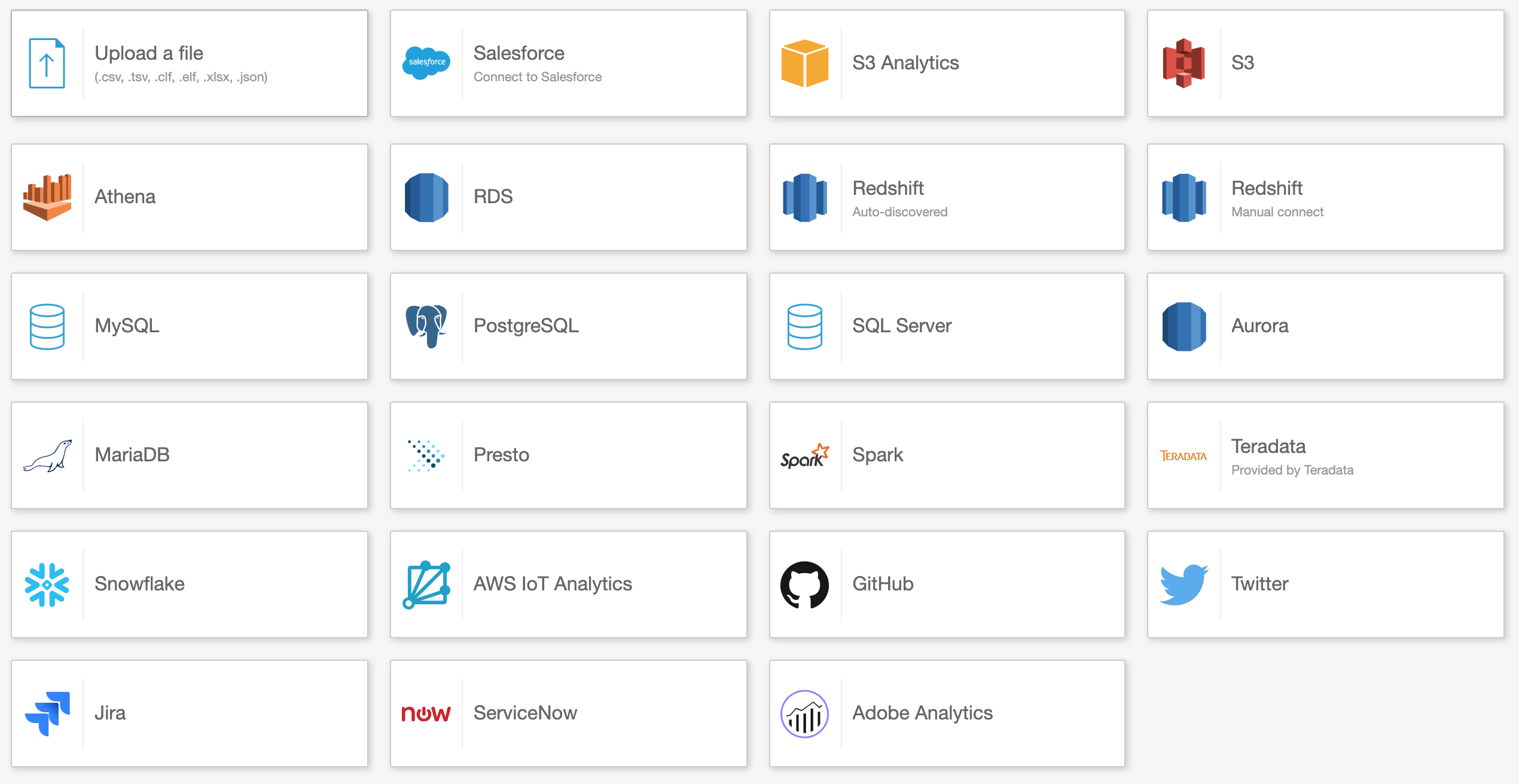
One of the benefits of the Amazon Web Service or AWS QuickSight is the ability to connect directly to your data source and build visualizations immediately after connecting the data. Here’s how to set up your data source:
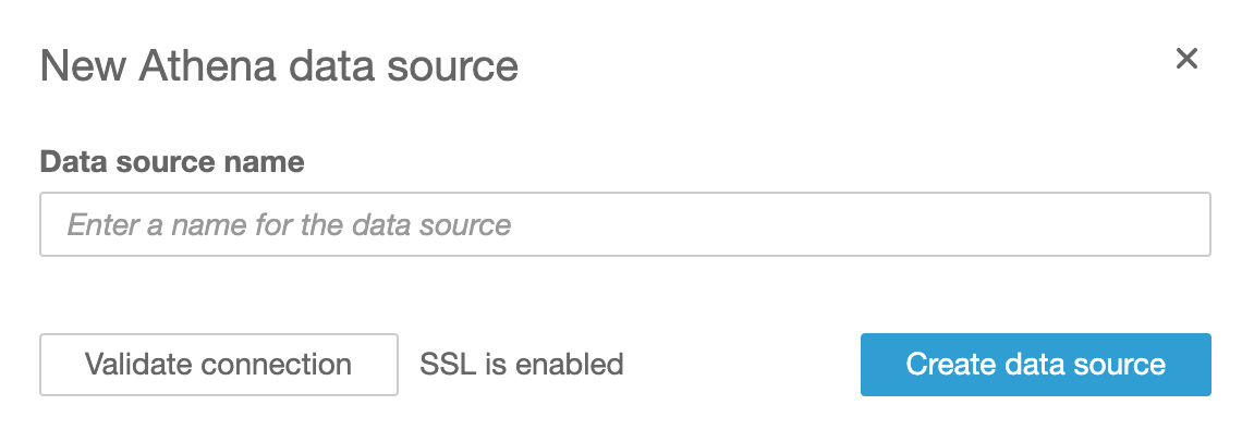
a) Choose the database which you want to connect to QuickSight (we’ll use Athena)
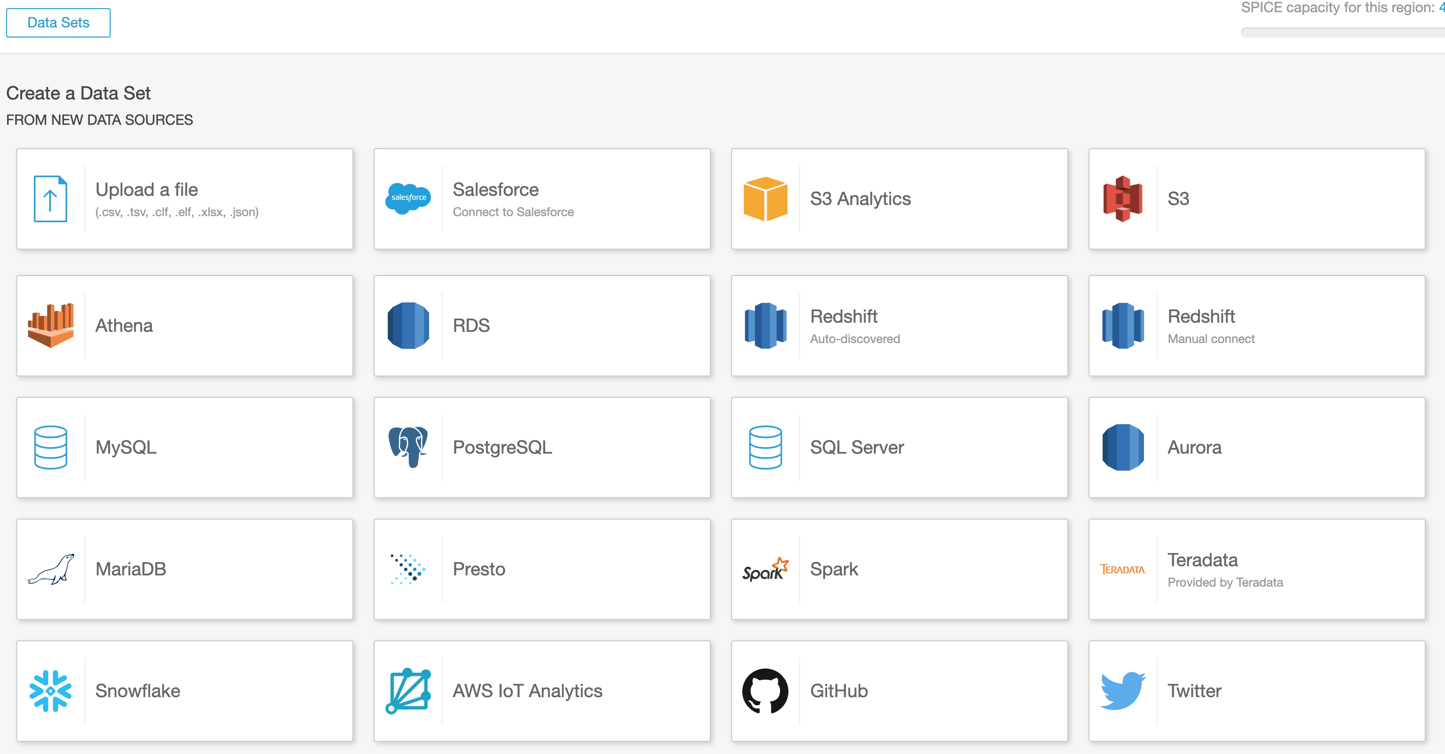
b) Name and create your data source
c) Choose a table or use custom SQL to query your database directly
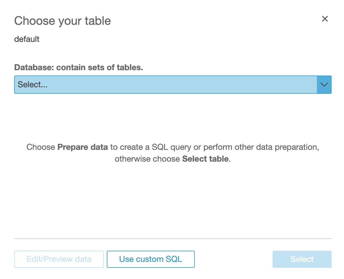
Using a full table linked to a large database may take longer to load and will use a greater capacity of SPICE, however it will allow you to access the full table in your analysis instead of the data available through a specific query
How to keep analysis up to date using SPICE
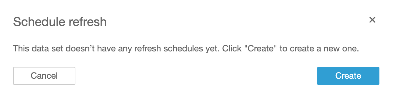
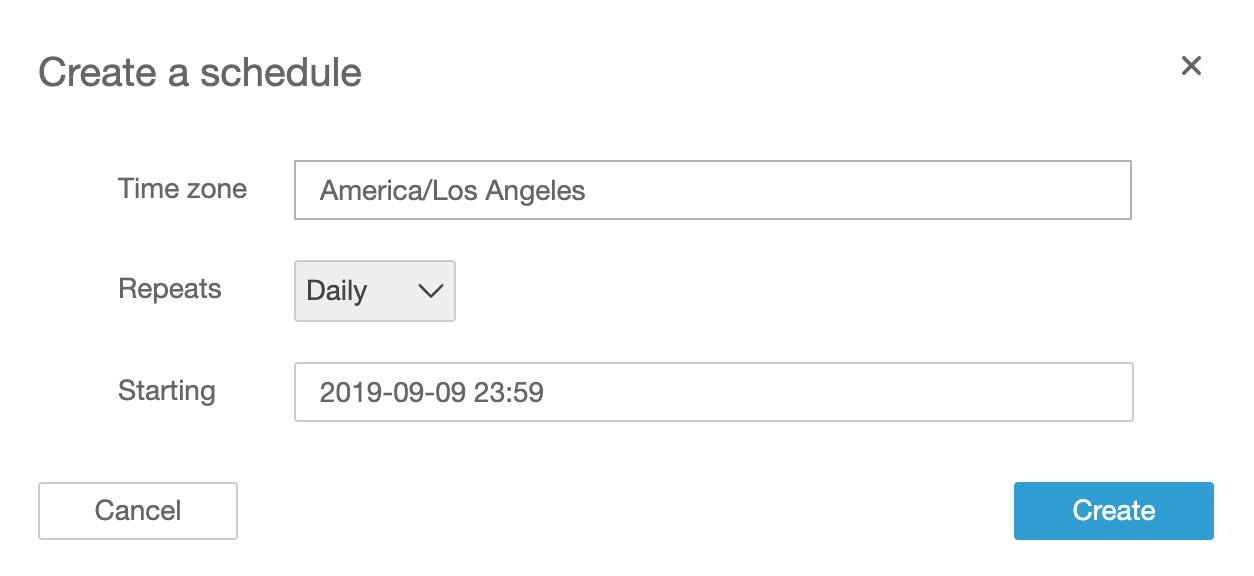
Once data sets are loaded in SPICE, they will be stored by Amazon and remain available and loaded in QuickSight, meaning your Amazon QuickSight dashboards will load within seconds while you build them. However, while the data is loaded into SPICE, it will not automatically update from your data source. In order to maintain the data, automated refreshes should be set up.
This can be done by navigating from the QuickSight homepage into “Manage Data” (upper right). From there, find and click on your data set, and click “schedule refresh”. You can setup as many as five refreshes per data set on a daily, weekly, or monthly cadence over a specific period of time.
Customizing visuals
There are a few key ways to customize visuals in QuickSight including:
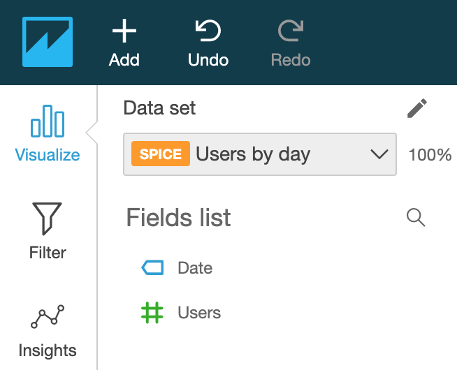
Choosing fields
After creating a visual, select the fields you want to include in the visual by clicking them on the left hand side. There are two types of fields: measures and dimensions. Dimensions are more commonly seen on the x-axis and are often the independent variable, while measures are commonly seen on the y-axis and are often the dependent variable for two-dimensional graphs.
If the data is not loaded to your liking, you are able to change a measure to a dimension or vice-versa by hovering over the field, clicking the arrow that appears on the right, and following the prompt to change to measure/dimension.
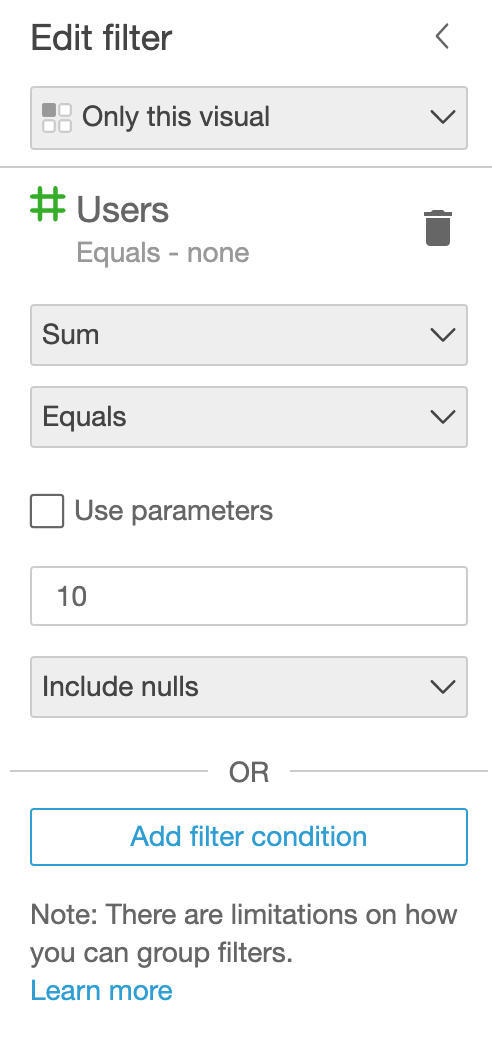
Filters
Filters can be navigated to on the left side underneath “visualize”. Filters are used to exclude or include certain data from the visual that is selected. Simply select your visual, navigate to filter, and select “Create one…”. From here, select a measure or dimension you wish to filter with and complete the workflow for the filter including aggregations, operators, values, and null responses, and click apply. Done!
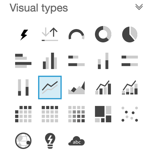
Choosing the visual type
Amazon QuickSight offers a variety of visual types for data analysis. Depending on your data, QuickSight offers pie charts, bar charts, line charts, area line charts, vertical stacked 100% bar charts, tree maps, scatter plots, heat maps, pivot tables, and more. The lightning option in the top left of the selection pane is the default, and will switch to a chart that is identified by QuickSight to best display the data, and is a quick and easy way to choose a chart type. For more information on how to pick a visual type for your chart, see this article and infographic by Active Wizards.
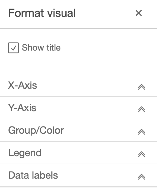
Formatting the visual
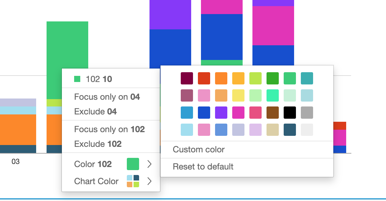
QuickSight focuses on ease-of-use and speed as opposed to extensive customizability that other data visualization tools offer. However, QuickSight does offer some tools beyond visual type and filters. By selecting the arrow dropdown in the top right of a visual, you can choose to format the visual. From here you will have options depending on the visual type including: axis labels, data labels, legend options, groups and colors, and title. For certain visuals, changing the colors may require you to select a data point on the graph and change that specific color.
QuickSight vs Tableau, Microsoft BI, and other competitors
The best use case for QuickSight is when the data which you want to visualize is stored in an AWS cloud system or other system integrated with QuickSight (see below). QuickSight is simpler, faster, and easier to use compared to competitors such as Tableau and Microsoft BI that feature a greater range of features for manipulating your charts. A few things to note with these tools are the availability for more complex scatter plots and charts, greater options for granulating data, and better optimization for finding and viewing specific data points when accessing an interactive dashboard.
From my experience with Tableau, connecting systems and loading data sets is more tedious than with QuickSight. The learning rate for Tableau is also slower than with QuickSight due to the complexity. However, Tableau offers a wide range of ways to manipulate and visualize data. Tableau and other popular data visualization tools also have a larger user base, leading to increased resources and forum content for problem solving and utilizations with the product.